[ Graphic design ]
Pitch deck design: build it for the three-second skim, then for the room
A pitch deck is read twice: fast and alone by the person who decides whether to meet you, then slowly in the room. In Papermark data for 24,541 decks the median slide got 3.3 seconds and 44 percent of investors reached the last slide. At normal reading speed that is about 13 words, so write each slide title as the point, put proof ahead of the appendix, and export a tagged PDF.
By LAIN10 min read
Many pitch decks are judged before anyone presents them. The first reader opens the PDF alone, moves fast and decides whether you get a meeting. So a deck has two audiences with different clocks: a skimmer who gives each slide a few seconds, and a room that gives you twenty minutes. Design for the skimmer first, because the room only exists if the skimmer says yes.
What 10/20/30 was written for
Guy Kawasaki's rule asks for 10 slides, 20 minutes and no type below 30 points. His reasoning, in his Entrepreneur column, is about a live room: audiences read faster than a speaker talks, so a crowded slide lets them run ahead of you and stop listening. A 30 point minimum forces you to choose the few points that matter. For a founder who does not know the room's age, he offers a formula: take the age of the oldest person in the audience and halve it, so a 60 year old in the room means 30 point type.
That is a rule for projection and a speaker. It says nothing about a deck that arrives by email, where no one is talking and the reader sets the pace. It also predates today's habits: Kawasaki's ten topics (problem, solution, business model, underlying magic, marketing and sales, competition, team, projections and milestones, status and timeline, summary and call to action) have no slide for market size or "why now". Treat it as a discipline for the room, not as a structure for the inbox.
What the data says about the read
Papermark, a document-sharing tool, published 2024 to 2026 data for 24,541 decks and 358,672 investor views. Four numbers matter for design:
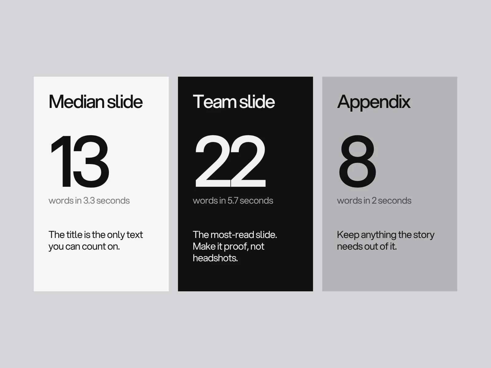
- The median slide gets 3.3 seconds.
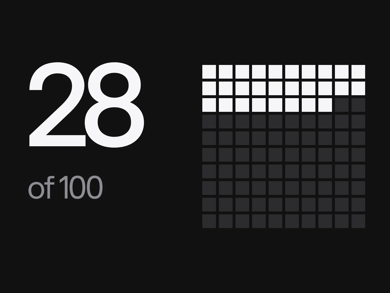
- 44 percent of investors who open a deck reach the last slide.
- The team slide is the most-read slide, at 5.7 seconds per view.
- Appendix pages get under 2 seconds each.
Completion also falls as decks grow: about 20 points between 8 and 16 pages, and around 40 percent completion at 16 and 18 pages. The most common length is 9 to 16 pages (46 percent of decks).
Two warnings before you trust these. First, the data comes from decks shared through one vendor's tracked links, so it is not a random sample of decks, and Papermark has a commercial interest. Second, the numbers are not stable across sources. DocSend's 2015 study put the average at 3 minutes 44 seconds. Its 2022 study of 320 decks reported investors spending 24 percent less time than in 2021, under three minutes on average, and giving up on decks that failed to raise after 2 minutes 13 seconds. Papermark reports an average view of 4.0 minutes yet 16 percent of views under 10 seconds, which shows how a few long sessions inflate an average. Read medians, not means, and expect the exact figure to move. The direction has not: investors skim.
The 13-word budget
Convert the dwell time into words. Brysbaert's 2019 review of 190 studies (18,573 participants) puts adult silent reading of English non-fiction at 238 words per minute, with most people between 175 and 300.
| Attention | Seconds | Words a reader can take in |
|---|---|---|
| Median slide | 3.3 | about 13 |
| Team slide | 5.7 | about 22 |
| Appendix page | 2 | about 8 |
| A 12 slide deck at the median | 40 in total | about 157 in total |
Brysbaert's rates apply to native readers aged 18 to 60 who stay on task; second-language readers and older adults read more slowly, and Papermark reports about two thirds of views from outside the United States. So 13 words is a ceiling, not a target.
What follows is the main design rule. At median attention, a whole 12 slide deck is about 150 words, less than half a page of text. If your slides carry 60 words each, more than three quarters of the words go unread. The only text you can count on is the title, so the title must carry the argument.
Write the titles as the story
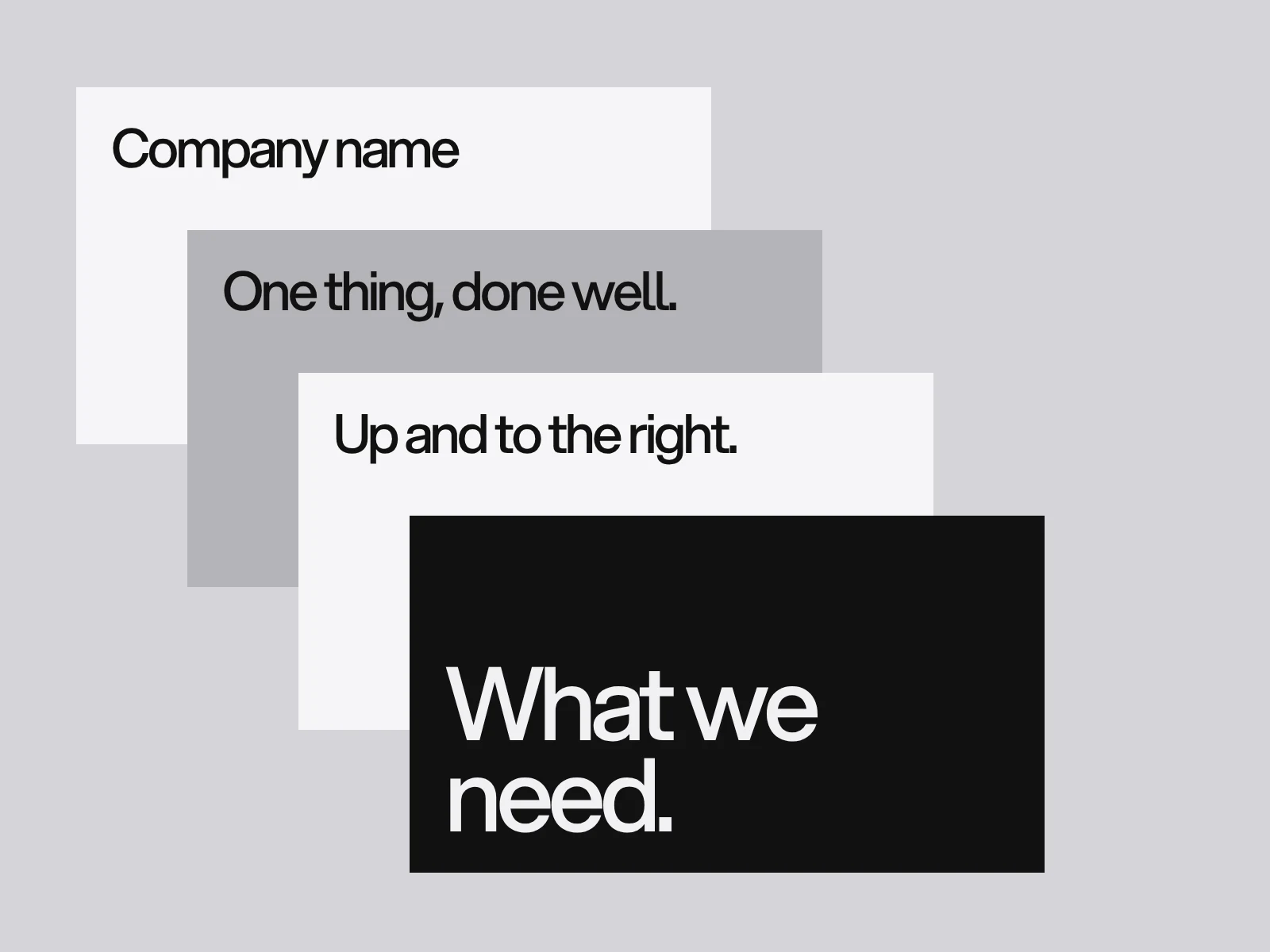
Consulting teams call this an action title: a sentence that states the conclusion, with the exhibit beneath it as proof. Write them first, in a list, before any design (a "ghost deck"). Then do the title test: read only the titles, top to bottom, and time yourself. If it reads like a table of contents, rewrite. If it takes a minute or more for 12 slides, the titles are too long to survive a skim.
| Label title (weak) | Action title (strong, 13 words or fewer) |
|---|---|
| Problem | Small carriers still book loads by phone and lose days to it |
| Solution | One screen matches a load to a truck in minutes |
| Market | Every regional carrier is a customer and most have no software |
| Traction | [N] carriers pay us monthly, up from [N] in [month] |
| Ask | We are raising [amount] to reach [milestone] in [N] months |
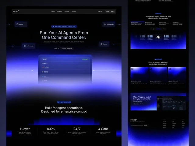
The examples are invented, with brackets where your own numbers go. Real decks show the same shape. The Syntra deck on our site is seven slides that make one argument in order: agents enter the workplace without an operating system, here is the layer that gives them one, here is how it works, why now, the model and the raise.
Slide order is the argument
Kawasaki's original ten topics, the Y Combinator guidance for seed decks (narrative over detail, with sets of related slides kept to one slide where possible and never more than three) and the Sequoia-style templates that circulate online all differ. That is the useful signal: there is no canonical order, only an argument. Choose the order that answers the reader's next question:
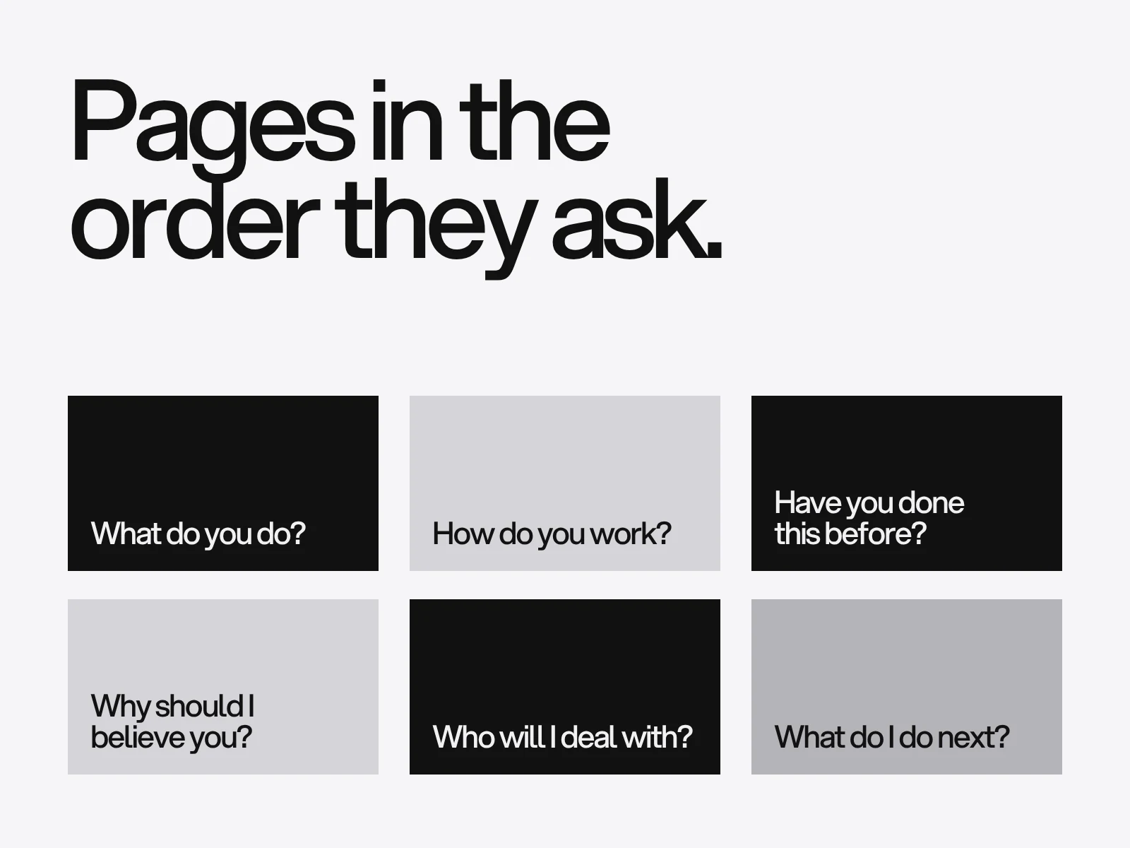
- Who you are and what you do, in one line.
- The problem, for whom, and how they cope today.
- Your answer, shown rather than described.
- Proof that it is wanted: traction, pilots, a waiting list.
- Why now, and why you.
- How you make money.
- The ask, with a number and what it buys.
The team slide gets the most seconds per view in Papermark's data, so design it as a proof slide, with names, roles and the one prior fact that makes each person credible, not a grid of headshots.
Type size depends on the screen
Kawasaki's 30 points assumes a projector. A deck read on a phone is a different case, and you can compute it. A widescreen slide is 960 points wide. Shown full width on a phone that is 360 CSS pixels wide in portrait, the scale is 0.375, so 30 point type renders at about 11 pixels. Turn the phone sideways to a 740 pixel viewport and the scale is 0.77, so 30 points becomes 23 pixels. To reach a comfortable 16 pixels, body text needs about 21 points on a landscape phone and 43 points in portrait. The viewport widths are typical values, not measurements of any one device.
The practical rule: in the room, hold Kawasaki's 30 point floor. In a deck read alone, 18 points is the least that stays at 14 pixels on a landscape phone, and portrait phones will need zoom whatever you do. Check the PDF at 360 pixels wide, and if a number is unreadable there, make it bigger or cut something else.
Two files from one story
Do not duplicate your narration on the slide. In a study of narrated slides, Yue, Bjork and Bjork found that on-screen text identical to the narration reduced learning, that slightly different text helped, and that students still preferred the identical version. In the room, show the point and say the detail. When the deck is read alone, the slide must stand alone.
| Situation | Slides | Text per slide | Notes |
|---|---|---|---|
| Live pitch, 20 minutes | about 10 | a title and one visual | 30 point floor, speak the detail |
| First send, read alone | 10 to 14 | title plus one proof line | the title test must pass, 18 point floor |
| Follow-up after a meeting | as needed | full sentences allowed | appendix is for answers to questions asked |
Keep the story and the order identical across versions and change only the density.
Where this goes wrong
Proof hidden in the appendix. Cause: investors skim, and appendix pages get under 2 seconds. Detect: your tracker shows readers stop before it. Fix: move the one chart that proves demand into the main flow and keep the appendix for questions.
Reading the average. Cause: a few long sessions inflate the mean. Detect: compare the mean with the share of views under 10 seconds. Fix: plan around the median slide, 3.3 seconds in Papermark's data.
A chart that only works with a voice. Cause: the chart was built for the presenter. Detect: show it to someone for three seconds. Fix: label the line directly, state the conclusion in the title and start the axis where the data starts without hiding a flat period.
A PDF made by printing. Cause: "Print to PDF" flattens the file into an untagged one with no title. Detect: open Document Properties. Fix: export with document structure tags. The W3C techniques ask for a document title with the display-title flag set (PDF18) and a default language (PDF16), and viewers then show your title instead of "final_v7".
An order borrowed from a template. Cause: the template was built for another company's argument. Fix: write the titles first and let the order follow.
Export and send
Run this as a pass or fail check before you send:
- Titles only, read in under 60 seconds, tell the story (12 titles of 13 words is about 40 seconds).
- No appendix page carries proof the story needs.
- Smallest meaningful text is at least 18 points on a 960 point slide, which is 14 pixels on a landscape phone.
- File under 10 MB. Gmail limits personal accounts to 25 MB, and encoding for email makes the message about 1.35 times the file size (measured with Python's email library), so a file over roughly 18 MB will not send.
- Title, language and tags set in the PDF, fonts embedded, links clickable.
- File name is the company and "pitch deck", with the date on the last page.
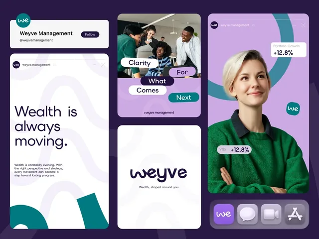
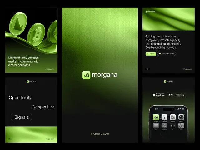
Graphic design work at LAIN, which includes decks, typically takes 2 to 4 weeks. The deck for Syntra was built on its brand, website and social media, and Weyve and Morgana each have a presentation designed with their identity. For a document that has to work with no presenter at all, see our guide to the company profile and how type size works in typographic hierarchy. If you want a deck built around your argument, send us a brief.
Frequently asked questions
How many slides should a pitch deck have?
Ten is Kawasaki's number for a 20 minute live talk. For a deck that is read alone, Papermark's 2024 to 2026 data (24,541 decks) shows 9 to 16 pages is the most common band at 46 percent of decks, and completion falls about 20 points between 8 and 16 pages. Aim for 10 to 14 and cut any slide the story survives without.
Where does the 30 point rule for pitch decks come from?
From Guy Kawasaki's 10/20/30 rule in his Entrepreneur column. He argued that audiences read faster than a speaker talks, so large type forces fewer words. His fallback is to halve the age of the oldest person in the audience. It was written for projected live talks, so check how a deck you send looks on a phone: 30 points renders at about 11 pixels on a 360 pixel wide portrait screen.
How long do investors spend on a pitch deck?
Sources disagree. DocSend reported 3 minutes 44 seconds in 2015 and under three minutes in 2022, down 24 percent on 2021. Papermark reports a 4.0 minute average view but 16 percent of views under 10 seconds, and a median of 3.3 seconds per slide. Averages are pulled up by a few long sessions, so plan around the median.
Should a pitch deck have an appendix?
Only for answers to questions you expect, not for proof the story needs. In Papermark's data appendix pages get under 2 seconds each, so the one chart that proves demand belongs in the main flow. Keep the appendix for detail that a reader asks for after the meeting.
How big can a pitch deck PDF be to send by email?
Gmail personal accounts allow 25 MB for the whole message, and encoding makes an attachment about 1.35 times larger (measured with Python's email library), so a file over roughly 18 MB will fail. Aim under 10 MB so it opens quickly on a phone. Workspace accounts have limits set by their administrator.
Do I need two versions of my pitch deck?
In practice yes. A deck you present can be sparse because you tell the detail. A deck read alone must carry its argument in its titles. Research on narrated slides found that on-screen text identical to the narration reduced learning, so do not read your slides aloud. Keep the story and order the same and change only how much each slide says.
Sources and fact check
Facts in this article that come from outside LAIN were checked on 28 Oct 2026 against:
- Guy Kawasaki, Entrepreneur: Rule of Thumb (the 10/20/30 rule)
- Papermark: Fundraising Report 2024 to 2026
- Brysbaert (2019), How many words do we read per minute? Journal of Memory and Language
- Yue, Bjork and Bjork (2013), Reducing verbal redundancy in multimedia learning
- TechCrunch: Looking at 320 pitch decks, here is what science tells us works best (DocSend, 2022)
- TechCrunch: VCs spend an average of 3 minutes, 44 seconds on pitch decks (DocSend, 2015)
- Y Combinator Startup Library: How to build your seed round pitch deck
- W3C WCAG 2.2 Technique PDF18: specifying the document title
- W3C WCAG 2.2 Technique PDF16: setting the default language
- Google Help: Gmail attachment size limit
Timelines, services and process described here are LAIN's own, as set out on our About and FAQ pages.
[ Keep reading ]