[ Branding ]
How to make a brand moodboard that settles decisions
A moodboard works because pictures can hold ideas that words cannot, and it fails for the same reason: two people can read one image differently. Caption each image with what you take, what you leave and the decision it drives, score agreement before design starts, and treat the images people split on as the real result.
By LAIN11 min read
A brand moodboard is the least precise document in a branding project, and that is why it works. Pictures can hold ideas that words cannot yet say, and they can hold ideas that contradict each other. The same looseness lets two people look at one image and agree for different reasons. So the job is not to collect good pictures. It is to find out, before any design exists, where the people who will approve the work read the board differently, and to write down what each picture is there to teach.
What a moodboard does, and the catch
Andrés Lucero's 2012 study "Framing, Aligning, Paradoxing, Abstracting, and Directing: How Design Mood Boards Work" interviewed experienced fashion, textile and industrial designers about their boards and found five roles. Boards frame the task (they set its limits), align the people involved (they carry a mindset), paradox (they let designers look at ideas that seem to conflict), abstract (they set concrete images beside abstract ones) and direct (they set a course for later work). Designers reach for them because words are often not enough to convey an atmosphere.
That list has two consequences for how you build one.
- A board you explore with may contradict itself. Paradoxing is a feature. The usual advice to keep every image consistent is right for the board you approve and wrong for the one you think with. Keep both, as described below.
- Aligning is a claim, not a guarantee. McDonagh and Denton's 2005 paper in Design Studies set out to test whether individual design students share a common perception of specific mood boards. They used rating scales and keywords with 62 students. That a study had to ask is the point: do not assume your reviewers read the board the way you do.
Words are slippery too
The standard advice is to start with word pairs and then collect pictures. That is sound, but words fail in the same way. Anastasia Sycheva, writing in Smashing Magazine in July 2026, describes a health tech client who wanted to look "disruptive". The word had to read as credible to conservative government medical buyers, so a loud, rebellious look would have undermined trust. One word, two opposite pictures.
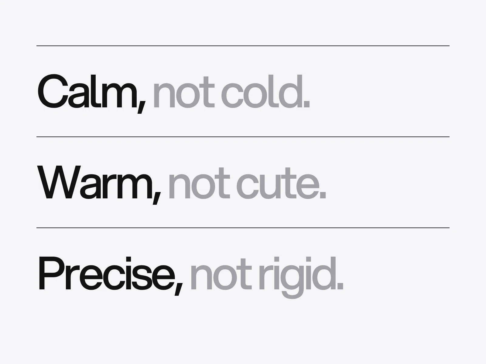
So before you collect anything, write each pair as things you can see. This is an example of the format, not a rule for every brand:
| Pair | Colour | Type | Space and image |
|---|---|---|---|
| Calm, not cold | Warm neutrals, no pure white on pure black | Medium weights, open spacing | Generous margins, one subject per frame |
| Warm, not cute | Earth tones, not pastels | No rounded display faces | Real people, not illustration |
| Precise, not rigid | Few tones and one accent | One family, a tight scale | A strict grid with one deliberate break |
Caption every image: take, leave, decision
Give each picture three short lines: what you take from it, what you leave, and which decision it drives. An image you cannot caption goes.
| Image | Take | Leave | Decision it drives |
|---|---|---|---|
| A dim hotel corridor in warm wood | The low light and the narrow warm palette | The heavy ornament | Background tone: a warm dark grey, not black |
| A railway timetable | The strict grid and the single typeface | The density | Text blocks stay narrow, one family only |
| A hand-lettered shop sign | The uneven, human spacing | The nostalgia | One detail in the logotype is allowed to be irregular |
The leave column is there because of design fixation. In Jansson and Smith's 1991 study, student designers who were shown pictures of existing solutions tended to reuse their features, including deliberately flawed ones, even when told to avoid them. The evidence is not uniform. Later experiments by Purcell, Gero and colleagues found the effect hard to replicate, with no fixation for industrial designers while mechanical engineers showed signs of it, and they suggested differences in discipline and experience as the reason. The practical reading: the risk is real enough to cost one column, and it is highest when a reference is close to the thing you are making.
That is also why looking outside your category helps, with limits. In Chan and colleagues' 2011 experiment, far-field and less common examples increased the novelty of ideas. In Chan and Schunn's 2014 study of a professional design team, far analogies raised the rate at which concepts were generated, but the concepts were more similar to the ones before them, not a jump to something new. Expect more ideas and some fresh ones, not a breakthrough.
Measure agreement before anyone designs
The cheap way to find out whether a board aligns people is to ask them to score it alone, before any discussion.
- Pick three to five word pairs from the strategy. Give each reviewer every image to rate on each pair, on a seven-point scale from -3 to +3. This is Osgood's semantic differential (1957): an odd number of points gives a neutral midpoint, and full instruments use eight to fifteen pairs, but a board only needs the pairs it is about.
- Collect the scores before anyone speaks, so a senior voice does not set the numbers.
- For each image calculate the mean and the spread (sample standard deviation).
Here is an invented example: six reviewers rate eight images on calm (+3) against cold (-3).
| Image | Ratings | Mean | Spread | Reading |
|---|---|---|---|---|
| A | 2 3 2 3 2 3 | 2.5 | 0.55 | Agree, on direction |
| B | 3 2 3 2 2 3 | 2.5 | 0.55 | Agree, on direction |
| C | -2 3 0 2 -3 1 | 0.2 | 2.32 | Split |
| D | 1 2 2 1 2 1 | 1.5 | 0.55 | Agree, on direction |
| E | 3 -1 3 -2 2 -3 | 0.3 | 2.66 | Split |
| F | 2 2 3 3 2 2 | 2.3 | 0.52 | Agree, on direction |
| G | 0 1 -1 0 1 0 | 0.2 | 0.75 | Agree, but says nothing |
| H | -1 -2 -1 -3 -2 -1 | -1.7 | 0.82 | Agree, the wrong way |
Look at C, E and G. All three average close to zero, so an average hides the difference. G is an image nobody feels anything about. C and E are images where the room is split, and those are the valuable ones: each is a disagreement about taste that would otherwise have surfaced in the third round of designs.
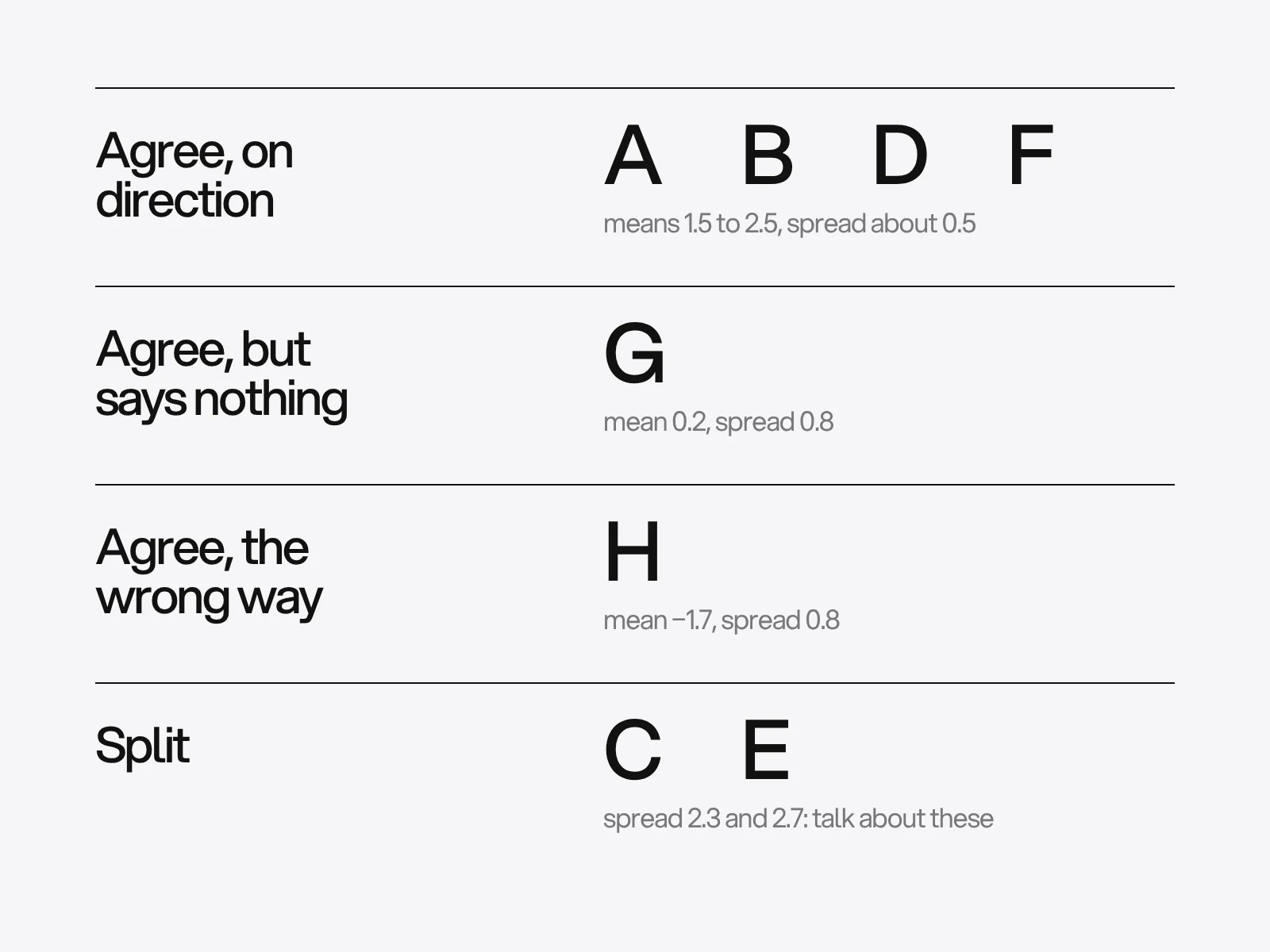
The cut-offs below are our judgement, not from a study. A spread of 1.5 or more on this scale means split: discuss it. A mean within half a point of zero with a low spread means the image says nothing: cut it. A low-spread mean of -1 or lower moves the image to the board of things the brand is not.
One more test catches what scoring misses. Show the finished board, without the words, to three to five people who matter and ask each for three adjectives. Count how many of your target words, or close synonyms, come back. If fewer than half the readers use at least two of them, the board does not say what you think it says. With so few readers this is a screen, not a statistic.
Keep two boards
Because boards do two jobs, keep two.
- The exploration board can be wide and can contradict itself. Lucero's paradoxing role lives here. There is no research that fixes the number of images. The common advice of 8 to 12 is a convention we could not trace to a study, so treat it as a limit for the board you present, not a law.
- The decision board holds only the images in the agree-on-direction group, each with its caption, plus a short board of the images that agreed the wrong way: what the brand is not.
From board to numbers: sampling colour
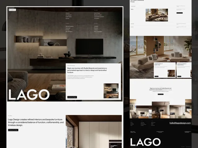
Colour is where a board turns into specifications, and the usual method is the weakest. The LAGO case page describes a palette that comes from the rooms: graphite and paper carry the pages, and the warm tones are sampled from photographs of walnut panelling, clay brick, an oak island and linen upholstery. They come out as Walnut #423128, Clay #8a674e, Oak #b4895b and Linen #d4c6bd, beside Graphite #181818 and Paper #f5f5f5.
Sampled tones belong together. That does not make them work together as text on a ground. Running the WCAG contrast formula on that palette (we calculated each pair):
| Pair | Contrast | Passes 4.5:1 text? | Passes 3:1? |
|---|---|---|---|
| Linen on Graphite | 10.66 | Yes | Yes |
| Oak on Graphite | 5.64 | Yes | Yes |
| Clay on Paper | 4.66 | Yes | Yes |
| Oak on Paper | 2.89 | No | No |
| Linen on Paper | 1.53 | No | No |
| Walnut on Graphite | 1.44 | No | No |
Oak is a good surface tone and fails as a line or text colour on paper. That is not a fault of the palette, it is information: each sampled colour needs a role (ground, fill, accent, text) before it goes into guidelines. Our colours and fonts guide covers the next step.
How you sample matters. A single pixel of a photograph is noisy. As an illustration, if pixel variation behaved like independent noise with a standard deviation of 8 levels per channel, one pixel would land within 16 levels of the true value only 95 per cent of the time, while the average of a 20 by 20 block (400 pixels) has a standard deviation of 0.4. Real textures are not independent noise, since brick genuinely varies, so the average also depends on where you place the block: sample the area that carries the idea, not a shadow joint, and take several. A sampled screen value is also not a print colour. Match it to a printed proof, as the guidelines article explains.
Where it goes wrong
- The board is approved on taste, not meaning. Cause: images are ambiguous, so people say yes for different reasons. Detect it with the blind read test. Fix it by captioning and scoring.
- One voice sets the room. Cause: whoever speaks first anchors the others. Fix: collect ratings alone first, then discuss the split images.
- A competitor's look slips in. Cause: fixation on a close reference. Fix: the leave column, and references from outside the category.
- Image rights. A 2026 licensing guide from the moodboard tool Storyflow, which is a company's position and not legal advice, says that private reference use is ordinary practice, and that the position changes when a board is shown to a paying client, published, or when a reference becomes final artwork. Keep boards internal, attribute sources, and never let a reference become a deliverable. Rules differ by country, so ask a lawyer for anything with money attached.
- Colour sampled from one pixel, then used as text. See the table above.
- The board lives on after its job is done. Once a direction is chosen, stop adding to it. The decisions belong in the guidelines.
What the board turns into
Samantha Warren's style tiles are the next step on the web: colours, type and interface elements such as buttons, without a layout, so a client can talk about the design in a way that is quick to change (we read secondary summaries, not her original article). Move from board to tile once the split images are resolved.
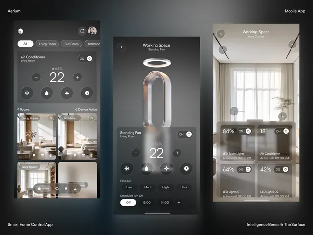
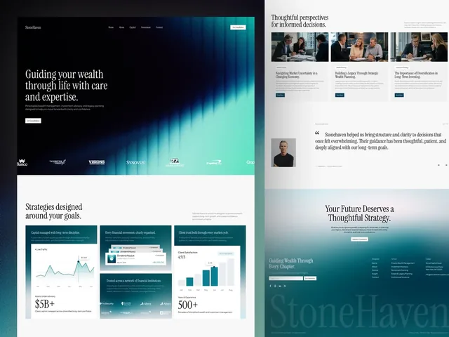
A resolved board reads as plain decisions. The Aerium case page describes one: frosted glass over photographs of quiet rooms, everything that is not a control left out, and the product the only object allowed to be bright. Stonehaven takes its palette from the design itself, and LAGO from its photographs. In each, someone can check any new screen against a sentence.
At LAIN the board sits in Alignment, the first of four phases, alongside a questionnaire, so that taste is discussed before design starts. If you want to build one with a team that does it every week, send us your references. The brand strategy guide is the place to get the word pairs from.
Frequently asked questions
How do I know if everyone reads my moodboard the same way?
Ask each reviewer to score every image alone on three to five word pairs, on a seven point scale, before any discussion. Then compare the spread for each image. A spread of 1.5 or more is a split worth talking about; an average near zero with a low spread means the image says nothing.
How many images should a brand moodboard have?
No study sets a number. The common advice of 8 to 12 images is a convention for the board you present. An exploration board can be larger and can contradict itself, because looking at conflicting ideas is one of the roles mood boards play for designers.
Can a moodboard make a designer copy someone else's work?
It can. Design fixation research, starting with Jansson and Smith in 1991, found that designers shown example solutions reused their features. Later studies found the effect depended on discipline and experience. Cheap protection is to write what you will leave behind for every image and to draw references from outside the category.
Can I show a moodboard with other people's images to a client?
Private reference use is ordinary professional practice, but the position changes when a board is shown to a paying client or published. A licensing guide from the tool maker Storyflow suggests attributing sources, not publishing boards with found images and never using a reference as final artwork. It is not legal advice, and rules vary by country.
What is the difference between a moodboard and a style tile?
A moodboard is deliberately loose and can hold contradictory references. A style tile, created by Samantha Warren for web design, commits to specific colours, type and interface elements without defining a layout, so a client can discuss the visual language and change it quickly.
How do I take colours from a photograph for a brand palette?
Average a block of pixels rather than reading one pixel, sample the area that carries the idea and take several samples. Then test every pair for contrast and give each colour a role, because tones sampled from one photograph can belong together and still fail as text on the same ground. A sampled screen value also needs a printed proof before it is a print colour.
Sources and fact check
Facts in this article that come from outside LAIN were checked on 28 Oct 2026 against:
- Lucero, A. (2012): Framing, aligning, paradoxing, abstracting, and directing: how design mood boards work (Aalto University)
- McDonagh and Denton (2005): Exploring the degree to which individual students share a common perception of specific mood boards (Loughborough University)
- AI EDAM: A study on the effects of example familiarity and modality on design fixation (reports Jansson and Smith, 1991)
- Purcell, Williams, Gero and Colbron (1993): Fixation effects, do they exist in design problem solving? (Environment and Planning B)
- Drexel University: Purcell and Gero, Design and other types of fixation (Design Studies)
- Chan et al. (2011): On the benefits and pitfalls of analogies for innovative design (Journal of Mechanical Design, University of Pittsburgh copy)
- Chan and Schunn (2014): The impact of analogies on creative concept generation, lessons from an in vivo study (University of Pittsburgh copy)
- Smashing Magazine: From Kickoff To First Concept, How To Turn Brand Strategy Into Visual Direction
- Simply Psychology: Semantic Differential Scale
- Storyflow: Moodboard images, commercial use and client boards
- Adactio: Style Tiles (Samantha Warren)
Timelines, services and process described here are LAIN's own, as set out on our About and FAQ pages.
[ From our work ]
[ Keep reading ]