[ Branding ]
Brand guidelines: what to include so other people can follow them
Brand guidelines exist so that someone who is not in the room can make the decision you would. That means numbers instead of adjectives: a logo minimum size derived from its thinnest stroke, colour values for each medium plus a table of pairs that pass contrast, a fallback font, tokens a developer can import and a named person for exceptions.
By LAIN12 min read
Brand guidelines have one job: to let someone who is not in the room make the same decision you would. A freelancer setting a poster, a printer choosing an ink, a developer styling a button. Every page is judged by that. A rule that needs the original designer to interpret it has failed, however good it looks in the document.
The evidence on whether guidelines get used is thin and mostly from vendors, so read it loosely. A Lucidpress survey from 2021, reported by Statista and MarketingProfs (Statista notes the source does not say how it was run), had about 30% saying their guidelines were well known and used by most of the organisation, and 13% saying theirs were unused or could not be found. Frontify, which sells brand portals, reported in 2021 that 67% of respondents used team-specific guidelines outside the official ones. A 2016 University of Virginia survey of its own users found 65% opened the university's guidelines at least once a month, mostly for photographs and logos. The pattern is consistent: people open guidelines to get an asset or a number, and make up their own rules when they cannot find one.
Write for five lookups
Order the pages by the question being asked, not by the order of the brand story. Keep the story to one page.
| Who opens it | The question | What must be on the page |
|---|---|---|
| Designer | What are the rules for logo, type, colour and layout? | The system pages, with numbers |
| Printer or packaging supplier | Which exact colour, how small, which file? | Colour per medium, minimum sizes, file names |
| Developer | What goes in the code? | Tokens or a copyable value list |
| Social media or sales person | What can I make myself, and what needs approval? | Templates and the exception route |
| Partner or press | How do I show your logo? | Clear space, misuse, downloadable files |
The logo: derive the numbers
Clear space should be a unit taken from the logo itself, so it scales with it. Published guides use the width of the letter M, the cap height, the x-height, the height of the symbol, or twice the height of a serif block. Pick one feature and write the rule as a multiple: "at least 1x on every side".
Minimum size is where guides disagree most. Six published logo guides listed in one search gave minimums of 24 px, 45 px, 66 px, 70 px, 85 px and 180 px, with millimetre equivalents that imply anywhere from 48 to 152 pixels per inch. A pixel has no fixed size on paper, so there is no convention to copy. Derive yours instead:
- Measure the logo's thinnest stroke or gap as a share of its height. Call it s.
- Decide the thinnest line you trust in each medium.
- Minimum height is that line divided by s.
Worked example for a logo whose thinnest stroke is 3% of its height:
| Medium | Thinnest line to trust | Minimum logo height |
|---|---|---|
| Screen, minimum | 1 CSS pixel | 33 px |
| Screen, crisp on every display | 2 CSS pixels | 67 px |
| Offset print on coated stock | 0.25 pt | 8.3 pt, 2.9 mm |
| Offset print, uncoated or in doubt | 0.5 pt | 16.7 pt, 5.9 mm |
| Packaging converter's floor | 0.75 pt | 25 pt, 8.8 mm |
| Reversed out (knocked out of a colour) | 1 pt | 33 pt, 11.8 mm |
The line values come from printers and conflict. One print shop gives 0.25 pt as the offset minimum, a forum answer from a printer says 0.5 pt if in doubt and 0.75 pt on uncoated stock, a packaging converter's spec asks for 0.75 pt, and reversed text and lines are usually asked to be heavier still. Write the number for the strictest medium the brand will really use, say it came from the printer, and make the contract proof the final test. Then add the rule that makes a minimum workable: below it, switch to the submark. Nobody should be told to shrink the full logo and hope.
For the smallest use, draw a version for it. Google's favicon page (checked 28 October 2026) asks for a square of at least 8 by 8 pixels and recommends larger than 48 by 48, in a stable, crawlable URL. A "multiple of 48 pixels" rule is repeated in older blog posts, but that page does not require it. A logo scaled to 16 pixels is rarely legible; a drawing made for 16 pixels is.
On the Outverge project page, each of the three lockups has its own grid, safe zone and short list of things it must never do: change colour, stretch, carry a shadow or turn. One list per lockup is more useful than one general "misuse" page, because each lockup fails in different ways.
Colour: values per medium, then the pairs
List each colour once, then say what to write for each medium.
| Medium | Specify | Why |
|---|---|---|
| Screen | sRGB HEX and RGB, as the master | Everything else is matched to it |
| Process print | CMYK, with the named profile and paper | HEX has no single CMYK equivalent; the numbers depend on the profile |
| Spot colour, packaging | Pantone number with the coated (C) or uncoated (U) suffix | The same ink looks duller on uncoated paper; converters give approximations, not matches |
| Tolerance | A colour difference, measured on the signed proof | ISO 12647-2 (2013 revision, as reported in a 2015 TAGA paper) uses 3.5 ΔE00 for cyan, magenta and yellow solids and 5 for black; ask your printer for theirs |
Our RGB and CMYK guide covers why the conversion cannot be automatic.
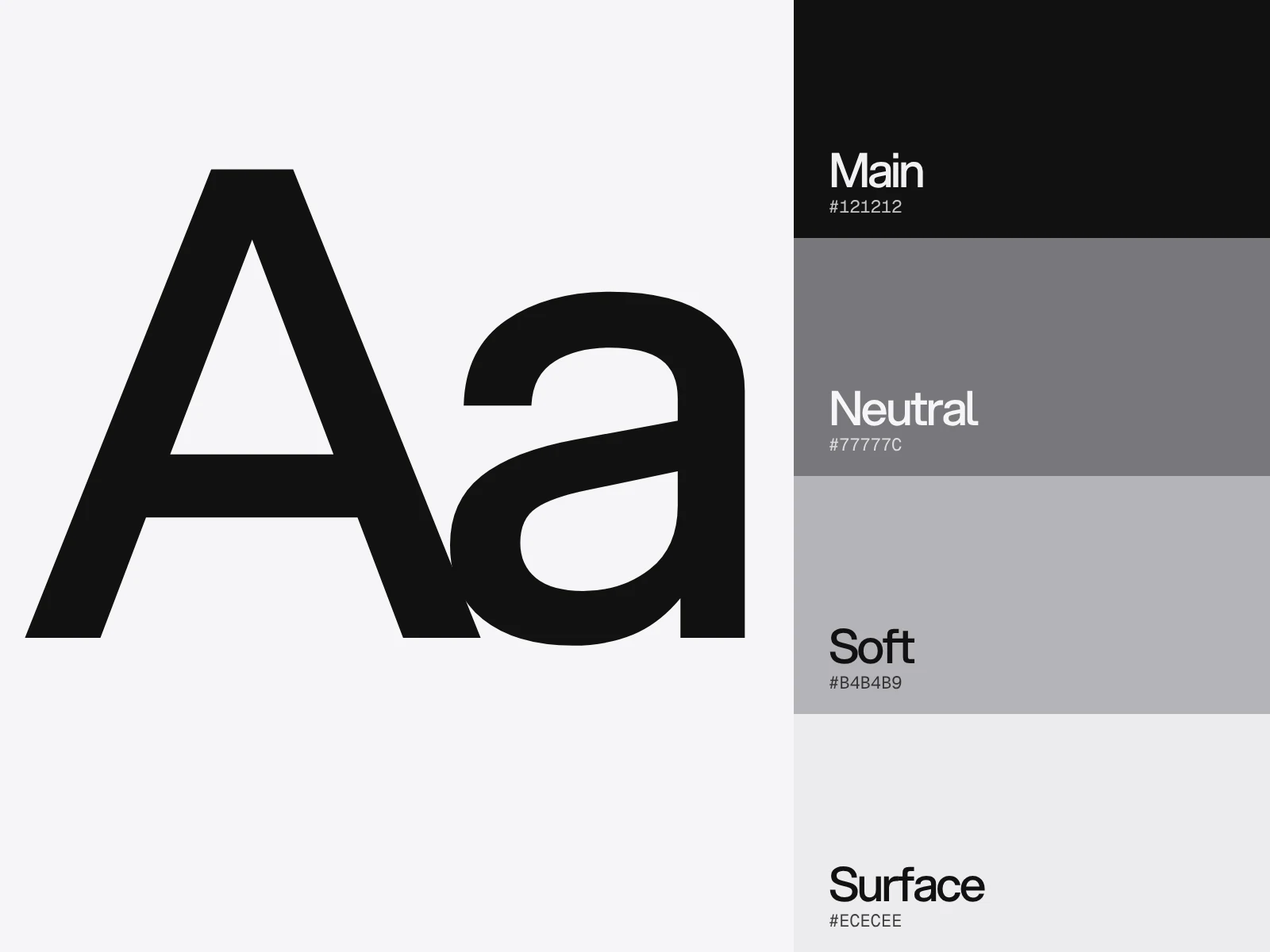
Then print the pairs. Do not make readers check contrast themselves. Southampton University generated every combination of its brand palette (441 pairs) with a script, Oregon State marks passing pairs in a grid, and Texas DIR keeps a separate table for the 3:1 needed by interface parts. We did it for the five swatches printed on the Outverge project page, using unrounded WCAG 2 ratios:
| Pair | Ratio | Use it for |
|---|---|---|
| White on Forest Green | 14.22 | Text |
| Sand Cream on Forest Green | 9.72 | Text |
| Olive Green on White | 4.63 | Text, with almost no margin |
| Olive Green on Black | 4.54 | Text, with almost no margin |
| Olive Green on Sand Cream | 3.16 | Graphics and large text only |
| Olive Green on Forest Green | 3.08 | Graphics and large text only |
| Black on Forest Green | 1.48 | Nothing |
| Sand Cream on White | 1.46 | Nothing |
The matrix shows what the swatch list does not: olive is a graphics colour on the brand's own two grounds. Large text means 18 pt, or 14 pt bold, and graphics and interface parts also need 3:1 (WCAG 1.4.11).
Three details to put in the notes. WCAG ratios must not be rounded: 4.499 fails 4.5:1, and 2.999 fails 3:1. Logos are exempt from the text rule, but a logo that is faint by choice, or only gains contrast on hover, loses that exemption. Thin type renders fainter than its specified colour, so a pair that scrapes through at 4.5:1 is worse in a light weight. Re-run the matrix whenever a colour changes. Our guide to choosing colours and fonts shows how to build a palette so most pairs pass from the start.
Type: specify the fallback
Guides list the typeface and its weights. The failures happen where it cannot be used. Email is the main one: according to several vendor guides, Gmail's web interface does not load custom fonts while Apple Mail does, and per-client support changes (caniemail.com is the usual place to check). Office documents and other people's websites are the rest.
So specify a fallback stack, and choose a fallback with a similar x-height and width, because a mismatch changes line breaks and makes layouts look broken. State where each weight can be obtained and what the licence covers. A desktop licence generally does not allow web embedding, and web licences are often capped by monthly pageviews. The hierarchy itself (sizes, line spacing, colour per level) is covered in our typography hierarchy guide.
Imagery, voice and templates: rules a stranger can check
Replace adjectives with tests. A rule passes if two people check the same piece against it and agree.
| Weak rule | A rule that can be checked |
|---|---|
| Use plenty of white space | Margins at least 1x the logo's clear space on every side; one idea per slide |
| Photography should feel authentic | People are not looking at the camera; no stock images of handshakes or headsets |
| Use colour consistently | The accent colour is for actions only; one accent element per screen |
| Keep the tone friendly | Sentences under 20 words; contractions allowed; no exclamation marks in headlines |
These are examples for an invented brand, not rules to copy. For voice, a few example headlines and button labels teach more than adjectives; see our brand voice guide. Templates beat rules, because nobody has to apply a template; see the Instagram carousel guide. NASA's 1976 Graphics Standards Manual, a ring binder by Danne and Blackburn, covered applications as well as marks: stationery, publications, signage, vehicles, aircraft and spacecraft.
Make the values machine-readable
A developer should not copy values out of a PDF. The Design Tokens Community Group published the first stable version of its format on 28 October 2025. It is a community group report, not a W3C standard, and Figma's variable import and export reportedly builds on it. In it a colour token's value is an object, not a string: colorSpace, components, an optional alpha and an optional hex fallback. A plain hex string is not allowed. For three tokens of an invented brand:
| Token | colorSpace and components | hex |
|---|---|---|
color.ink | srgb, 0.0706, 0.0706, 0.0706 | #121212 |
color.teal | srgb, 0.0667, 0.5059, 0.5255 | #118186 |
color.paper | srgb, 0.9647, 0.9647, 0.9686 | #f6f6f7 |
Publish the file next to the PDF, and keep one master. The two will drift if both are edited by hand.
Ownership and exceptions
Name a person who answers questions and approves exceptions, put their contact on the first page, and date every version. Without an exception route, people invent one. The figure most often quoted for why this matters, that consistent presentation raises revenue by 23%, traces to a 2016 survey by Lucidpress and Demand Metric of over 200 organisations, and is an estimate by respondents whose brands had consistency problems. Later figures of 33% and 10 to 20% attributed to the same vendors could not be traced to a report. Treat it as a hunch, not evidence.
Where guidelines go wrong
| What happens | Cause | How to spot it | Fix |
|---|---|---|---|
| People make their own rules | The official file is hard to find, or lacks the asset they need | Ask who built the last three slides from scratch | Put files and templates on page one, on one URL |
| Print does not match the screen | HEX has no fixed CMYK; profile and paper differ | Compare the proof to the screen in daylight | Name the master, the profile and the tolerance |
| The logo clogs at small sizes | Minimum size chosen by eye | Print it at the minimum on the worst paper | Derive it from the thinnest stroke; add a submark |
| Brand colours fail as text | Pairs were never calculated | Run every pair | Publish the matrix |
| Two versions circulate | PDFs sent by email | The file names differ | One URL, a date, a version |
| Nobody can apply a rule | It is an adjective | Hand it to a stranger | Rewrite it as a test |
Test it before you publish
Give the guide to someone outside the project and set five tasks with a 30 minute limit: lay out a one-page flyer, pick the right logo file for a dark photograph, choose a text colour for a button, write a headline, and ask for an exception. A task passes when the answer is found in under a minute and matches what you would have said. Then check:
- Every logo rule has a number, and the minimum size is derived for screen and print.
- Colour has HEX, a CMYK value with its profile, a spot reference if used, and the table of pairs.
- A fallback font is named for email and documents, and the licence covers web, app and email.
- Logo files and templates are linked from the first page.
- There is an owner, a date and a version.
Guidelines belong to the final delivery phase of our process, with files and a handover. The Outverge page lists what its guideline covers: concept, main logo, variations, grid, structure, safe zones for three lockups, where each is used, the logo on every ground, what it must never do, palette, typefaces and type hierarchy. If you need a brand system with a guide your team can apply without you, get in touch.
Frequently asked questions
What should brand guidelines include?
The logo (versions, clear space, minimum size, misuse), colour values for each medium and the pairs that pass contrast, typography with a fallback font, imagery rules, voice, templates, and practical details: file locations, an owner and a version date. Write each rule so that someone outside the project can apply it and check the result.
How do I set a minimum size for a logo?
Measure the logo's thinnest stroke as a share of its height, choose the thinnest line you trust in each medium, and divide. With a 3% stroke, a 0.5 pt print line gives a 16.7 pt (5.9 mm) height, and a 1 CSS pixel line on screen gives 33 px. Printers disagree on the line, so use the strictest medium and confirm on a proof.
Which colour values should brand guidelines list?
A HEX and RGB value as the screen master, a CMYK value with its named profile for process print, and a Pantone reference with its coated or uncoated suffix for spot colour. HEX has no single CMYK equivalent, so name the master, the proof and the tolerance. Add a table of text and background pairs with their contrast ratios.
Should brand guidelines be a PDF or a website?
The evidence is thin. Vendor surveys suggest people give up when they cannot find the current version, which is the weakness of emailed PDFs. Whatever the format, keep one URL, show the version and date, and provide the logo files, templates and tokens beside it. A PDF can be an export of that page.
Do brand guidelines have to meet accessibility rules?
Logos and brand names are exempt from the WCAG text contrast rule, but all other text and interface parts must pass: 4.5:1 for normal text, 3:1 for large text and for interface parts and graphics. Ratios are not rounded, so 4.499 fails. Print the table of approved pairs, and re-check it whenever a colour changes.
What are design tokens, and should guidelines include them?
Design tokens are named values, such as a colour, that design tools and code both read. The Design Tokens Community Group published a first stable format on 28 October 2025, where a colour is an object with a colorSpace and components rather than a hex string. Including a token file means developers import the values instead of copying them from a PDF.
Sources and fact check
Facts in this article that come from outside LAIN were checked on 28 Oct 2026 against:
- W3C: Understanding Success Criterion 1.4.3 Contrast (Minimum)
- W3C: Understanding Success Criterion 1.4.11 Non-text Contrast
- Design Tokens Community Group: Design Tokens Format Module 2025.10, Color
- W3C Design Tokens Community Group: specification reaches first stable version
- Google Search Central: Define a favicon to show in search results
- Statista: Usage of brand guidelines among U.S. organizations 2021
- University of Virginia: Brand Guidelines end-user survey summary
- Times Higher Education: A colour matrix to make visual content more accessible
- Print Planet forum: Minimum line weight in offset printing
- TAGA 2015 proceedings: An investigation of factors influencing colour tolerances
- Inc.: If you want to make 23% more money, then get consistent
- Space.com: Reissue of the NASA Graphics Standards Manual
Timelines, services and process described here are LAIN's own, as set out on our About and FAQ pages.

[ Keep reading ]