[ Branding ]
The logo design process: eight stages and the tests between them
A logo is designed in stages, but quality comes from the tests between them: judging at 16 px and in one colour, exploring in parallel, clearing the mark by image search, and securing a written assignment of the copyright. Define the tests before drawing, and feedback becomes a comparison with criteria instead of a debate.
By LAIN10 min read
Every guide lists the same stages: brief, research, sketches, vector concepts, presentation, refinement, files. The stages are not where logos are won or lost. They are won in the tests between the stages, and lost when nobody defined those tests before drawing began. This article keeps the stages and adds the gates: the sizes a mark must survive, what the research says a recognisable logo looks like, how to clear the mark itself, and who owns the result.
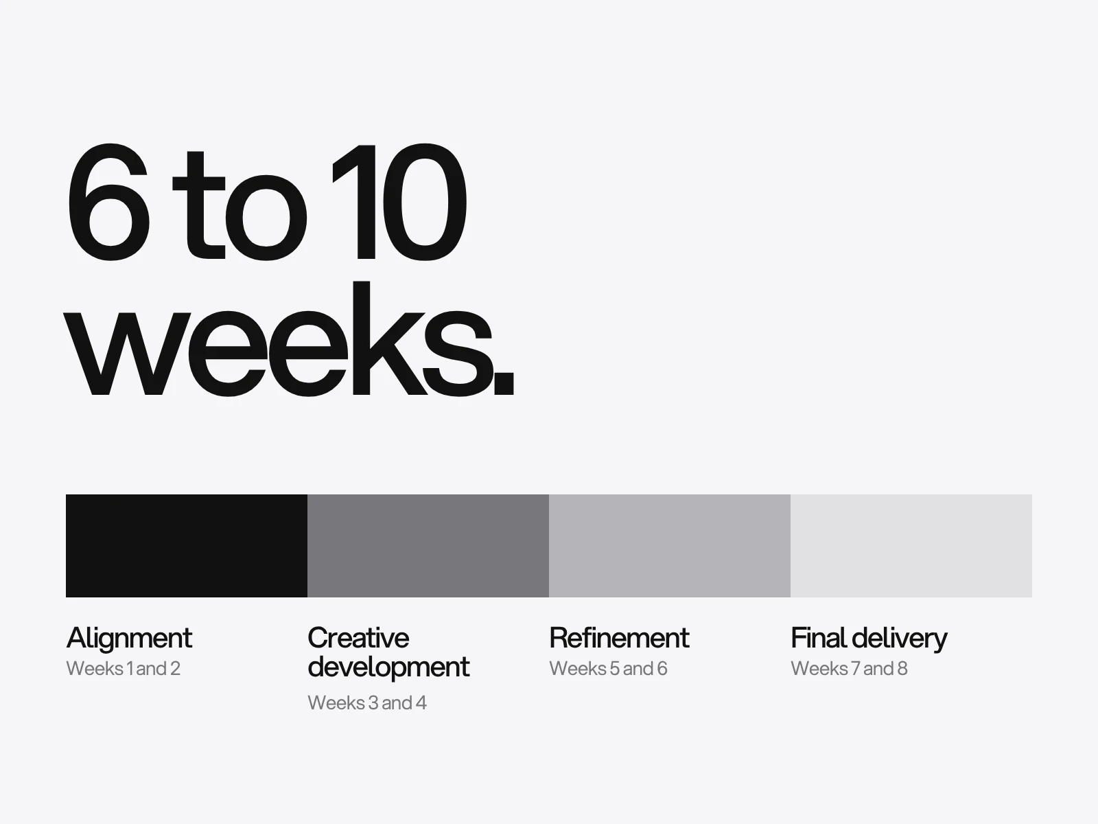
At LAIN a branding project runs through four phases, Alignment, Creative development, Refinement and Final delivery, and typically takes 4 to 6 weeks. The phases are LAIN's; where each gate sits is our suggested mapping, and the clearance step is advice, not a claim about every project.
| Stage | Phase | The gate it must pass |
|---|---|---|
| 1. Brief | Alignment | The smallest and largest sizes are written down |
| 2. Explore | Creative development | At least three different ideas, not three versions of one |
| 3. Vector | Creative development | Black on white, built on a grid, no colour crutch |
| 4. Stress tests | Refinement | Passes the small, one-colour and reversed tests |
| 5. Clearance | Refinement | No near match on an image search |
| 6. Present | Refinement | Judged against the written criteria |
| 7. Refine | Refinement | Optical corrections done at the real sizes |
| 8. Deliver | Final delivery | Files tested, copyright assigned in writing |
Write the tests into the brief
A brief usually says what the business is. Add the three things a logo can be tested against.
- The smallest place it will appear, in pixels or millimetres. A browser tab is 16 px on many screens, and Google's favicon page asks for a square image of at least 8 by 8 px and recommends more than 48 by 48.
- The hardest background: a photograph, a dark ground, a stamp.
- Three words for the feeling, each with a "but not", so that "friendly" is judged against "childish".
If you have not written your position, start with the brand strategy guide. A logo can only be compared with something written.
Explore in parallel, then decide who sees what
Sketch quickly, in volume, and by concept: wordmark, symbol, monogram and combination mark for each idea. The evidence for working in parallel is a Stanford experiment (Dow and colleagues, ACM TOCHI, 2010) in which novices designed web ads either several at a time or one after another. The parallel group produced ads that did better on click-through and expert ratings, and were judged more diverse. The limits: novices, ads and not logos, and the gain in confidence was self-reported.
That is evidence about how a designer should explore. It is not an answer to how many logos a client should see. For NeXT, Paul Rand presented a single logo, with a twenty-page booklet printed in fifty copies, opening with the question "What should a logo for NeXT look like?" and arguing that "it is needs, not wants, ideas, not type styles which determine what its form should be." The two practices are compatible. Explore widely in private. Then show one direction if the client trusts the argument, and two or three if the decision is contested or has several owners. Which is right depends on the client, not on a rule, and we found no study that settles it.
What the research says a recognisable logo looks like
Henderson and Cote (Journal of Marketing, 1998) analysed 195 logos on 13 design characteristics. For high recognition they recommended logos that are very natural, very harmonious and moderately elaborate. As we understand the terms, natural means the logo depicts recognisable real-world things, harmonious means balanced and orderly. The full text was not available to us, so read it before quoting it. The US-based guidelines were tested again in Chile in 2007.
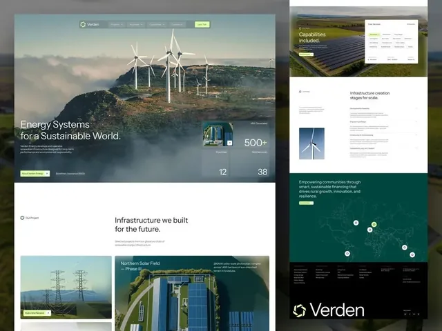
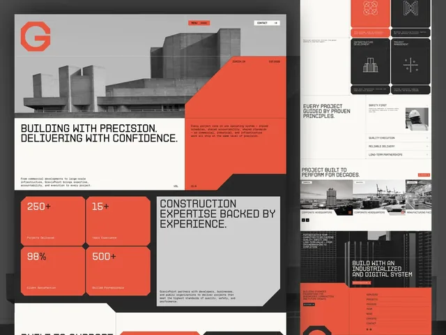
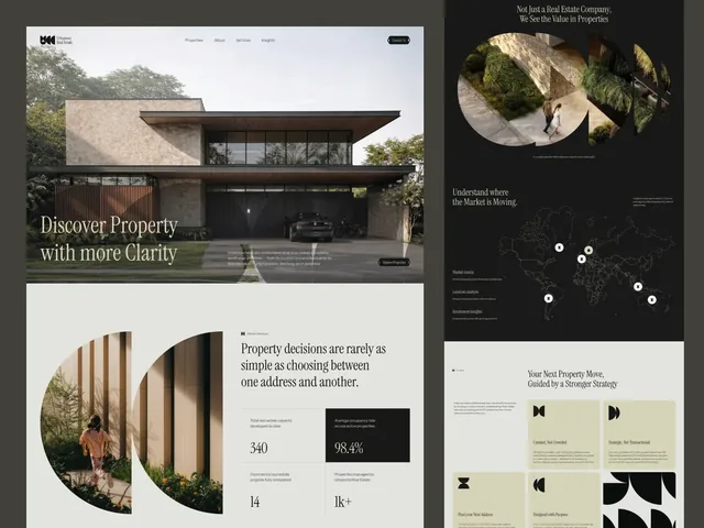
The useful reading is "moderately". A mark that is too simple can be unrecognisable and one that is too elaborate cannot be drawn at 16 px. It is a reason to test, not a formula. Verden's page describes six identical blades around a hexagon, straight edges only, so that it holds from a favicon to the footer. GravixPoint cuts every corner of an octagon at forty-five degrees and cuts its tiles and cards the same way, so the logo reads as the first of them. Urbanova's mark is five half-discs of one circle. Each is a rule that can be checked, which is what makes it testable.
Build it so it survives pixels
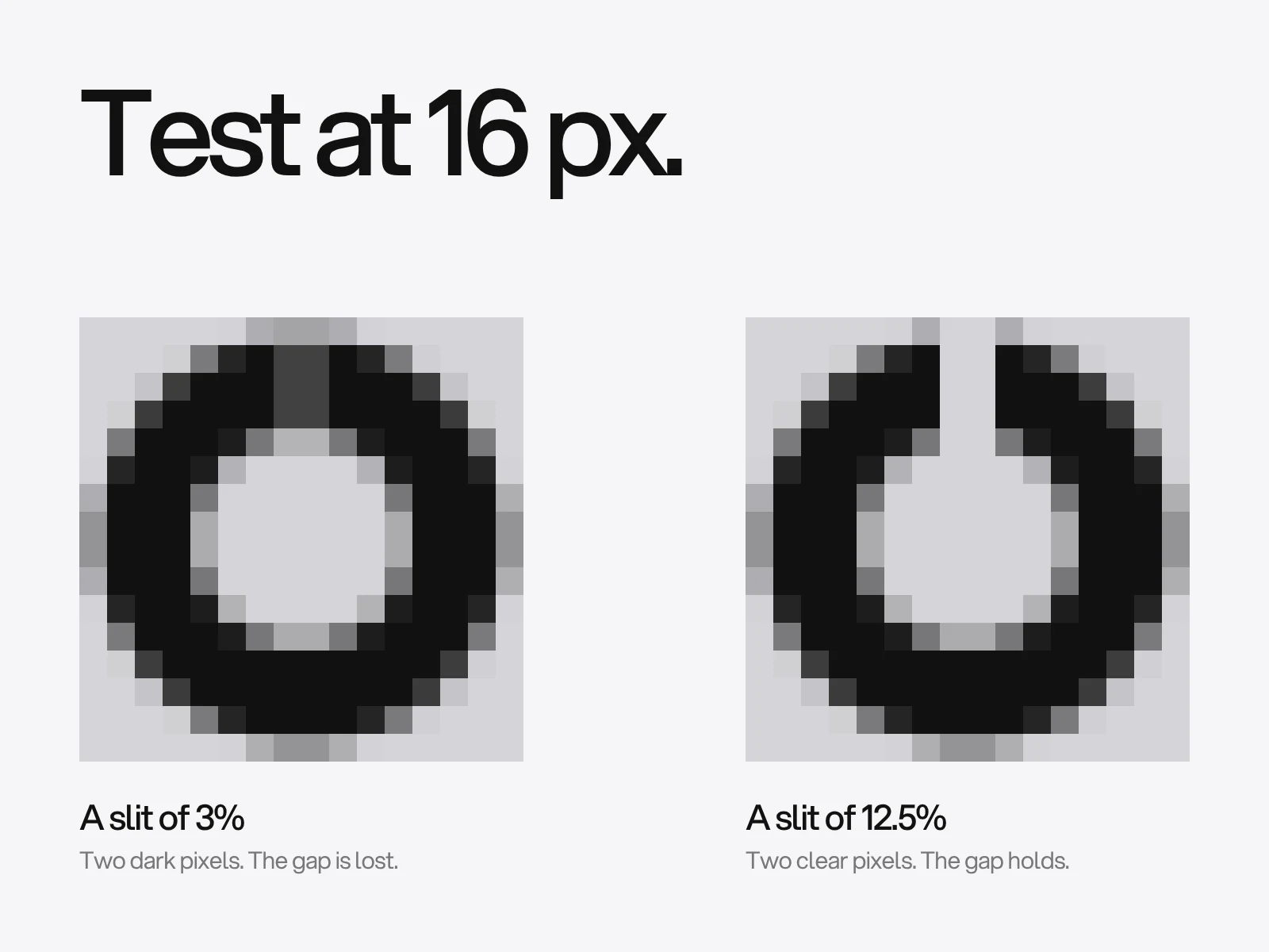
At 16 px, one device pixel is 6.25 per cent of the mark's width. A gap, counter or notch narrower than that cannot be drawn. We tested it by rendering a ring with a slit through its top at 16 px and measuring how much contrast the slit kept as its position on the pixel grid changed.
| Slit width | In pixels at 16 px | Contrast kept at best and worst alignment |
|---|---|---|
| 3 per cent of the mark | 0.5 | 50 and 25 per cent |
| 6.25 per cent | 1 | 100 and 53 per cent |
| 8 per cent | 1.3 | 100 and 65 per cent |
| 12.5 per cent | 2 | 100 per cent either way |
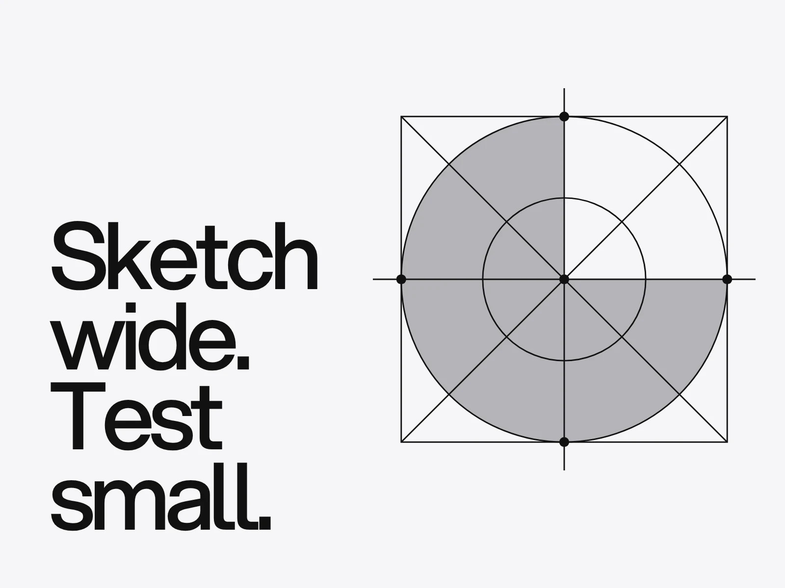
The rule that follows is ours: keep every gap, counter and stroke you need to see at least 12.5 per cent of the mark's width if it must read in a 16 px favicon. On a 2x screen the same favicon is 32 device pixels and the limit halves, but you do not control the screen.
Three other checks belong here.
- One colour. Convert to solid black and to solid white. A mark that relies on a colour step to separate two shapes fails.
- Reversed and on a photograph. WCAG 2.2 says text that is part of a logo or brand name has no contrast requirement, so a pale grey wordmark can be compliant and still unreadable. Compliance is not the test.
- Optical corrections. A circle the same height as a square looks smaller. Type designers extend round shapes beyond flat ones, typically 1 to 3 per cent for an O, and Karow's recommendation in Digital Formats for Typefaces is 3 per cent for O and 5 for A, with more for pointed shapes. These figures are for type, so use them as a starting point and judge by eye at the size the mark will be seen.
Clear the logo, not only the name
Names get searched. Logos often do not. A logo is a figurative mark, and offices classify the pictures in marks with the Vienna Classification: 29 categories, divided into divisions and sections, with several codes given to one logo for its different parts. WIPO's Global Brand Database has searched by image since 2014, and its Vienna Classification Assistant (2020) suggests codes from an uploaded logo.
For each of the final two or three marks, upload it, filter by the country and the Nice classes of your goods, and look for anything with the same main shape. Record what you find and decide with a trademark attorney. Similarity is judged on the mark as a whole and on the goods, not only on shape, so this is a way to find problems early, not to certify a logo.
Ownership is part of the delivery
Under US law, a logo commissioned from an independent designer is generally not a "work made for hire", even if the contract says so. The Copyright Office's Circular 30 lists nine categories of commissioned work that can be made for hire (contributions to a collective work, parts of an audiovisual work, translations, supplementary works, compilations, instructional texts, tests, answer material for tests and atlases), and it requires a signed written agreement. A logo is not on the list. The copyright therefore stays with the designer until it is assigned in writing. Employees are different. Other countries differ again, so take local advice. The practical step does not change: the contract should assign the rights, and the delivery should include the source files.
Also check the licence of any typeface used in the mark. Outlines of a font are still derived from a licensed design, and licences vary. This is a point to confirm, not a conclusion.
Feedback that compares, not debates
Ask for feedback in three parts: what the person observes, which written criterion it concerns, and the evidence. "The notch closes at 16 px" cites the small-size gate. "It does not feel premium" cites nothing, and is a prompt to ask what in the brief it contradicts. Gather the notes into one list from the decision makers. Five conflicting lists cost more than any design change.
Where it goes wrong
| Failure | Cause | How to detect | Fix |
|---|---|---|---|
| It looks good large and fails small | It was judged on a slide | Render at 16 px | Run the stress sheet before presenting |
| Endless rounds | There were no written criteria | Count notes that cite none | Agree criteria in the brief |
| A near match is found later | Only the name was searched | Run an image search | Clear the mark in stage 5 |
| The printer or embroiderer rejects it | No one-colour test | Convert to one colour | Test in stage 4 |
| The business cannot show it owns it | No written assignment | Read the contract | Assign the rights in writing |
| The mark needs its colour | Colour separated two shapes | View it in black | Redraw the shapes |
A copyable checklist
Give each line a pass or a fail.
- The brief lists the smallest and the hardest places the logo will appear.
- At least three ideas that differ in concept were explored.
- Every candidate works in solid black on white.
- Every gap and stroke is 12.5 per cent of the mark's width or more, or the favicon uses a simplified mark.
- The mark works in one colour, reversed and on a photograph.
- Round shapes have optical corrections checked by eye.
- An image search and a Vienna code search were run for each final mark.
- Feedback cites a written criterion or a new fact.
- The contract assigns the copyright in writing.
- Files were tested in the places they will be used; see logo file formats.
If that list is ready, get in touch. The finished marks belong in your brand guidelines, and the wider identity work is what makes the logo work every day.
Frequently asked questions
What are the steps in the logo design process?
A brief, research and sketching, vector concepts, stress tests, clearance, presentation, refinement and final files. The tests between stages matter most: judge the mark at 16 px, in one colour and reversed, and search for near matches before presenting it.
How long does it take to design a logo?
At LAIN a branding project, which includes the logo and the wider identity, typically takes 4 to 6 weeks. The logo itself needs time for exploration, tests and refinement, and the schedule depends mainly on how quickly feedback is consolidated.
How many logo concepts should a designer show?
The designer should explore many privately. What the client sees is a judgement call: one direction when the client trusts the argument, as Paul Rand did for NeXT, or two or three when the decision has several owners. A Stanford study found that designing in parallel beat designing in series, but it tested ads, not what to show clients.
How small does a logo need to work?
Google asks for a favicon of at least 8 by 8 px and recommends more than 48 by 48. At 16 px one pixel is 6.25 per cent of the mark, and in our test a gap of 6 per cent lost up to half its contrast. Keep needed gaps at 12.5 per cent of the width or more.
Do I need to check a logo for trademark conflicts?
Yes, the picture as well as the name. Marks are coded with the Vienna Classification and WIPO's free Global Brand Database can search by image. Run the final candidates through it, filter by your countries and classes, and ask a trademark attorney to judge any close match.
Who owns the copyright in a logo?
In the United States a logo from an independent designer is not a work made for hire, because it is not one of the nine categories the law allows, so the copyright stays with the designer until assigned in writing. Employees differ and other countries have their own rules. Put an assignment in the contract.
Sources and fact check
Facts in this article that come from outside LAIN were checked on 28 Oct 2026 against:
- Google Search Central: Define a favicon to show in search results
- W3C: Web Content Accessibility Guidelines (WCAG) 2.2, 1.4.3 Contrast (Minimum)
- Dow and others: Parallel prototyping leads to better design results, ACM TOCHI 2010
- Paul Rand: Design Literacy, NeXT (1997)
- MSI: Designing positively evaluated logos (Henderson and Cote)
- WIPO: About the Vienna Classification
- WIPO: WIPO launches unique image-based search for trademarks
- U.S. Copyright Office: Circular 30, Works Made for Hire
- Wikipedia: Overshoot (typography)
Timelines, services and process described here are LAIN's own, as set out on our About and FAQ pages.
[ From our work ]
[ Keep reading ]